Is this the quickest Website Improvement Hack? – Improving The Headlines On Your Website
When we buy a website one of the key renovation techniques we use is to go over the site and improve the headings. We especially focus on:
- Any sales related headlines or
- Any key Call To Action Related Headlines
- Any key SEO related headlines
The Importance [And Advantages] Of Irresistible Headlines:
We find by improving a websites headlines we can often dramatically improve these key money making metrics of our websites:
- Higher conversions
- Higher engagement (which is great for SEO)
- Your content will be more clickable and shareable
As the original “Father of Advertising” David Ogilvy, once famously said: “Five times as many people read the headline as read the body copy. When you have written your headline, you have spent eighty cents out of your dollar.”
Headings are commonly overlooked by website designers. But in fact, they’re actually one of the most important parts of your website. When used properly, headings show people straight away what your webpage is about as soon as they land on your site.
A poorly written (or poorly placed) heading can lose the attention of your visitor, and as a result can lose you a lot of money in your online business.
Here are some of our top tips for using effective headings in your website…
Writing Irresistible Headings – The Foundations
Basically, a headline is a statement. It’s a little sentence (not too long), that shows your visitor very quickly, simply and obviously what your page is about. There are 3 ways that you can write a headline:
- State the main benefit of the product, business or service.
- Highlight the problem that people have, and how your business is going to solve it.
- Describe your unique selling proposition (USP).
In other words, you want to clearly show, why should someone buy from your business rather than the competition. Remember, it always comes back to the 5-second rule. Within a couple of seconds, you need to hit your visitor between the eyes why they should stay. Show them why they shouldn’t click off your page, and why this is the place they should actually be.
Examples of Converting Online Headlines that Work
Let’s give you some examples so you can see these headline principals in action. It’s good to see live examples so you can see how effective these headlines are in keeping your visitors on the page.
Classic Car Insurance Website uses Effective Headlines to Highlight Their Benefits
This first example is in the US and is a classic car insurance provider. It’s a great website, and you can see straight away (within five second) what this website’s about. It’s about getting quotes and the headline says, “Better coverage built for classics at a price you can afford.” Done! It’s just told me what they’re all about and it’s specifically targeted for classic cars. So as a visitor looking for classic car insurance, I’m interested.
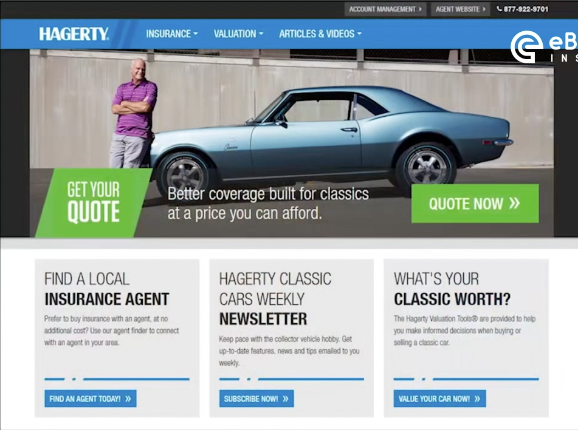
You can see the benefits here too. They provide better coverage built for classics. This is insurance tailored for you as a classic car owner at a price you can afford. This is important because classic car insurance can be very expensive. So, they’re addressing some of the main problems that people find when they’re looking for classic car insurance. They’re saying, “Hey, we do it better and we do it cheaper.”
So this is a great headline. It’s really grabbing hold of your attention, and telling you what they’re about. You can see straight away why you should actually bother to click that button to say, “Get a quote now.” And you can see there, this is a lovely call to action; it tells you exactly what to do.
Popular CRM Platform uses Headlines to Target their Ideal Audience
Here’s another one we want to show you, so you can see an example from a different market. This is for a customer relationship management software. The company is called Salesforce and it’s a very successful company that’s grown incredibly quickly. And when you land on their webpage, the headline clearly says, “Sell smarter and faster with the world’s #1 CRM.”
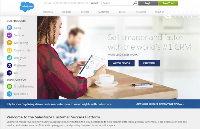
So, straight away it’s telling you, “Hey, we’re the best. We’re the world’s number one, and it means you’re going to be able to sell stuff faster.” What’s really interesting about this headline is if you don’t know what CRM is, it doesn’t actually matter. That means you’re not their target market. So for them, as the web designer of that business, they don’t care.
I know what about CRM is and I’m interested because I’m thinking, “Oh, sell smarter and faster with the world’s #1 CRM,” because that’s what CRMs should do. CRM is customer relationship management software. These guys do it really well. So it’s a really clear, punchy headline that grabs me within five seconds.
You can see there is also a subheading they’ve used too. They’ve spelled it out a little bit for you with four extra words, which is very smart. “More leads, less work”. So that’s what we all want as an online business – we want more leads with less work. So, that’s a big benefit they’re offering, and they’ve used this as a subheading, which is perfect.
Using Bullet Points and Subheadings on your Website
The final part of headings is using bullet points and subheadings. When you’re doing your market research (data collection) you want to gather information on:
- What’s the call to action?
- What are the benefits?
- What’s the USP?
- Why would someone buy from this business?
- What sort of stuff do you have to offer?
All this information we’ve gathered, we want to bring together in that headline, in the image, and also in bullet points or subheadings.
Bullet points and subheadings can include things like:
- The important features or benefits (or the unique selling proposition)
- Why someone should buy from that business rather than the competition
- Answer questions that people are looking for
- A call to action (what are they supposed to do?)
- Include any promotions or offers you have.
We need to get that important information right up front at the top of the website. So if it’s a business that solves a problem that lots of people are looking for the answer, you might want to provide that straight upfront on the website.
Include the Benefits using easy-to-read Bullet Points
So, let’s have a look at how some websites have done that. Here’s an example of another Classic Car Insurance company. As you can see in the image below (of their home page), right up front on the right-hand side next to the car, is their classic policy benefits. This basically lists why you should choose them. It includes a whole list of the benefits of why you should choose that business over the next one.
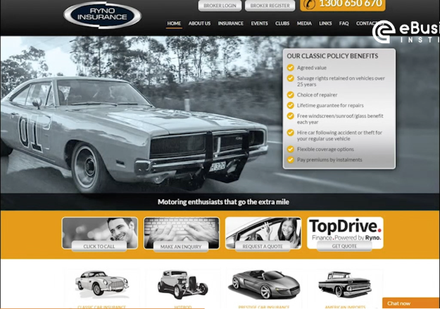
So, if I’m a skim reader, I can probably read that in less than five seconds. So I basically know the essence of that entire website and what they want within five seconds. Pretty much everyone are skim readers now. We’re all flicking through websites really quickly. So, this rule is pretty important, and this example of using bullet points and subheadings is really well done. There’s no point in putting a massive, big block of text that no one’s going to read.
Smart use of Subheadings and Visual Icons
Here’s Budget, another insurance company, Budget Direct, and they’ve got (right up front in the headline), “Get a huge 25% off car insurance”. But what they’ve done is put their bullet points in a different way than its subheadings.
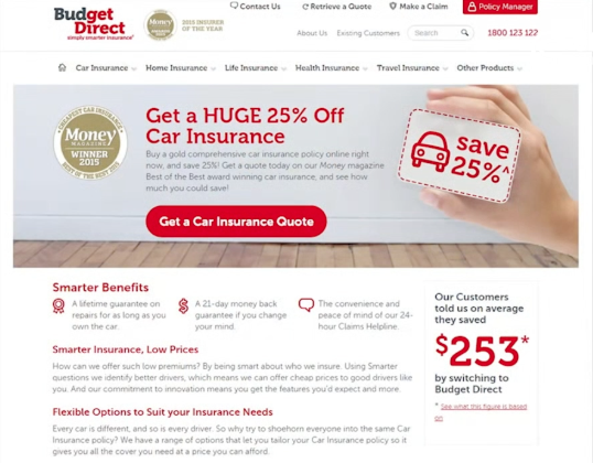
Just below that image, can you see where it says, “Smarter Benefits“? That’s the subheading and then they’ve got three feature boxes where there’s a little image and a little text explaining what it is. This is great idea because people are visual and they might be drawn to the images and are then more likely to actually read the text. The problem using just a big block of text is that people don’t know where to look and then their eye just gets lost.
There’s also got some clear subheadings underneath that. It starts out with “Smarter Benefits”, “Smarter Insurance, Low Prices” and “Flexible Options to Suit Your Insurance Needs”. You could maybe argue that the pictures are not that relevant here. But other than that, this is a very well-designed website and you can easily skim read it. This website is very much designed for skim readers (who are reading the text), and there’s social proof sitting up there as well.
Make more money off your website by improving the headlines!
Improving headlines can be a fantastic quick and simple way to get low hanging fruit when it comes to renovating a website so make sure you use this key strategy for improving your website. And if you want 3 more quick tips for improving your website make sure you check out this article.