We teach students from all over Australia how to make money online using websites. But there’s 3 common mistakes that we see over and over again that unfortunately can cost business with a web presence a lot of money.
I wanted to share these simple tips with you here. If you identify any of these with your online business, then this might be a great refresher to go get it fixed.
Tip 1: Avoid getting hacked by keeping your Passwords Private
Now, this tip doesn’t just apply to your website, but for anything online where you need to set an account or password. It might seem really obvious, but from working in the digital world for over 10 years now, we’ve seen countless of people lose a lot of money (and clients) from not keeping their data safe.
When it comes to the security of our data, unfortunately still in Australia, we are very bad at using our family members’ names or our pets’ names or our family members’ dates of birth as passwords. This just makes them really easy to guess. They don’t even have to be hacked by a professional.
You want to keep your passwords complex and updated often. A good way of managing this is using a password manager such as LastPass, but there’s a variety of different password managers out there. I highly recommend you find a preferred password manager and learn how to use it. Always use passwords thar are a minimum of 12 characters because that is just going to make everything you do more secure. And where you can, use a 2FA app to help prevent passwords being updated without your consent.
When it comes to managing the websites that you build, never use ‘admin’ as the login details. Using admin is the very first thing a hacker would try. They put in ‘admin’ and then they start trialing different passwords. This is how most people get in and hack websites because we make it too easy for them.
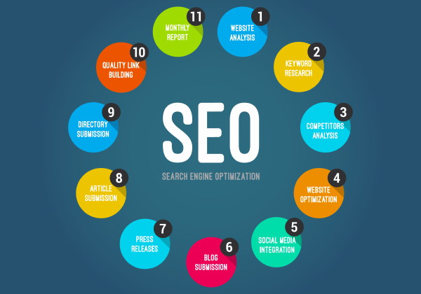
Tip 2: Never game the Google system to make money online faster
When it comes to making money online, it’s always tempting to try and cut some corners. Whilst we want to go fast, our aim is to be building blue-chip sites that will stand the test of time in Google’s eyes.
Black hat SEO means doing search engine optimization (SEO) that goes against Googles webmaster guidelines. So it means gaming the Google system. It’s bad because it doesn’t create long lasting virtual assets. You won’t be able to sell these websites later on if they get a Google penalty.
While black hat SEO can sometime give you quick results, it’s actually really dangerous. Google’s getting smarter. Their algorithm will catch up to you and you can easily be penalised. It’s seriously not worth doing.
Do white hat SEO if you want to get rich and build long term assets. You can read about getting started with search engine optimiztaion and what Google does like here.
If you want short term ranking results, you are taking a big risk if you use popular black hat SEO techniques, and I don’t recommend you do it. It’s not something we teach in our courses because it’s just not sustainable.
In 2 or 3 years’ time, all the black hatters will be wiped out because google gets gets better and better at catching them.
Tip 3: Improving website conversions by having a clear purpose and better navigation
An unclear website purpose is a common mistake we see over and over again. Don’t underestimate how much money you’ll miss out on if you make it hard for your visitors to know what to do when they come to your website. We’ll show you an example using the image below:
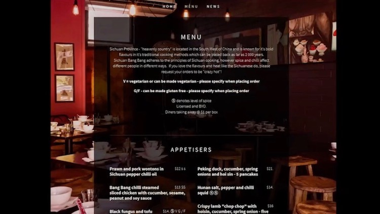
This is the website from one of our local restaurants, and we absolutely love this place. They are awesome but we struggle when it comes to using their website.
Read on to understand the simple website design faults of this website that make it difficult to use… and how to fix this websites conversions…
Make your website visibly easy to read
The first issue is, how easy do you find it to read? We personally find it very hard! Be very careful of black backgrounds with white writing on websites. It can be very difficult to read this online, which means that anyone struggling to read your website is more likely to go, “I can’t be bothered,” and they’ll move onto someone else.
You’ve got to remember, the decision of “yes” or “no” is now literally a swipe or a click. It’s not something where your visitor has to actually get up out of their seat and walk out, or physically walk away from the booking counter.
Make it easy for your customers to contact you via your website
The next issue is one we see all the time, and it’s the practical usage of the website. Let’s stop and think about the contact details here. The restaurant is a really well-known Chinese restaurant in Brisbane. It’s a very popular place to go and eat, and has really good food etc.
But from a website design point-of-view, how are you going to use the website? If we’re regulars, what are we most likely using this website for? We’re probably in the car, somewhere out and we’re thinking, “Let’s ring them and either book a table or order takeaway.” Imagine you’re on your mobile phone. But – can we actually see the phone number anywhere on this page? Sadly this is way too common on websites – there is no easy contact details or no easy way to ring the business. Simple web design solution – make sure there is a HIGHLY VISIBLE CONTACT TELEPHONE NUMBER on the website 🙂
What’s the purpose of your site? Make it clear on the page
When it comes to restaurant websites, of course we all go to the menu. We want to know what food’s available, and what we’re going to order. And once we’ve seen the menu, we decide, “Ok, yes, I want to eat there. I’m going to order that. I need to either call and book a table, or I need to call and put my order in.”
I’m on the menu page on a mobile. So now I have to click somewhere else to try and find the phone number and then navigate back to the menu so that I can actually read it again in order to see what I want to order. This is where we really need to think about how people are using the website and what they’re wanting to do, especially on mobile.
And luckily, on this particular website they have actually changed this, and it’s updated their website now! Now they do have a phone number on the menu web-page, which is awesome.
But too many retail-orientated business websites (that have physical locations), break this simple web design rule. They don’t have an easily contactable number (or contact details), or address and opening hours (above the fold) to make it easy for people. Because if that’s the purpose of your website, that’s what should be there.
You don’t want to lose people. And I’ve got to admit, there’s been times when I thought, “I would like to order takeaway, but I can’t be bothered with this process.” I know that sounds weird, doesn’t it? That I can’t be bothered clicking back and forth. But, you’ve got to remember, that’s the psychology of how people work online, so you can’t make it hard for them.
So these are 3 of the most common and simple web design mistakes people make with their websites that can cost businesses money. Hopefully this article was a good reminder to fix up your website so it makes you more money.